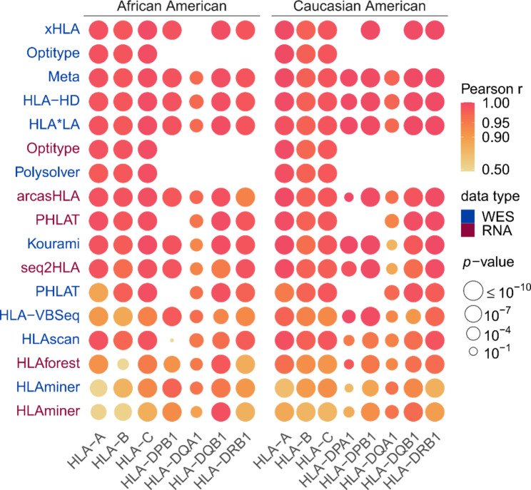
Fig. 3.
Correlations between observed and expected allele frequencies. Heatmap of correlations between observed allele frequencies and frequencies expected in an African American and in a Caucasian American population. Vertical axis indicates the tools, with different colours representing the data type (WES or RNA) on which the tool was applied. Rows were sorted according to the mean correlation of the tool. Size of the circles indicates the P value of the correlation test as indicated in legend. Absent circles indicate that the tool could not be evaluated on that gene

