
FIGURE 3.
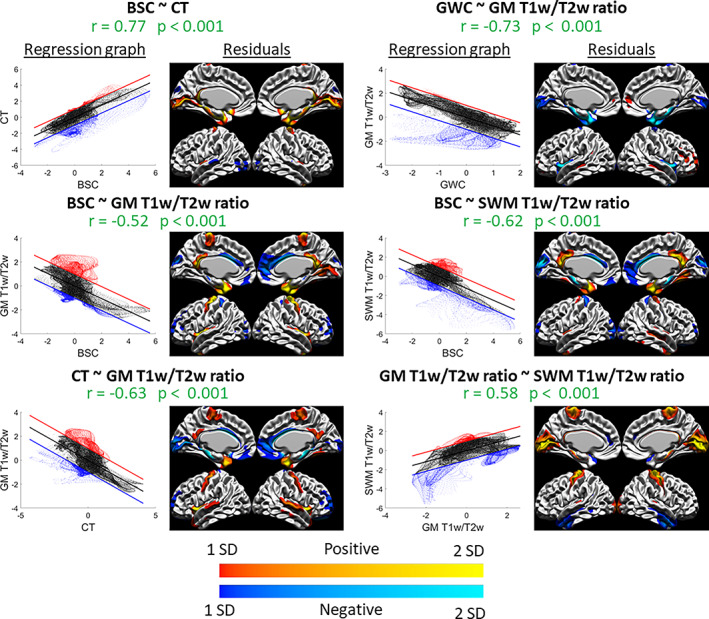
Spatial distribution relationships: graphs and residuals. For each significant correlation, the left figure is the spatial regression in graph form, where the x‐axis is the Z‐scored values of the first marker, the y‐axis is the Z‐scored values of the second marker, the regression line is shown in black, and the +1 SD and −1 SD lines are shown in red and blue, respectively (representing the thresholds set for values that are far from the regression line and exhibit less the observed relationship). The right figure is the vertex‐wise residuals from the regression thresholded at ±1 SD (cold colors indicate vertices below the regression line in blue in the left graph and warm colors indicate vertices above the regression line in red in the left graph, and lighter colors indicate higher residual values and darker colors indicate lower residual values). For example, the relationship between GWC and GM T1w/T2w ratio (top right) is linear in most areas, as seen in the graph on the left, except for a group of vertices below the regression line which we can locate in the residual figure on the right (in this case, in the insula and medial temporal pole).