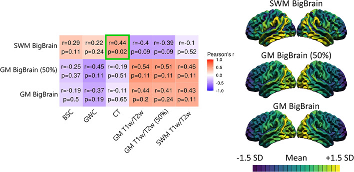
FIGURE 5.

Correlations between MRI markers and histologically derived overall cell density from the BigBrain dataset. For each marker, the mean and standard deviation were calculated and used to threshold the colors. More specifically, purple areas indicate lower values relative to the mean of that marker, while yellow areas indicate higher values. The correlation matrix includes Pearson's correlation coefficient (r) and FDR‐corrected p‐values. The color of each correlation block is linked to the correlation coefficient: positive coefficients are red and negative coefficients are blue, high coefficients are more saturated and low coefficients tend toward white. Significant correlations at the FDR 0.05 level are highlighted with a green outline.
