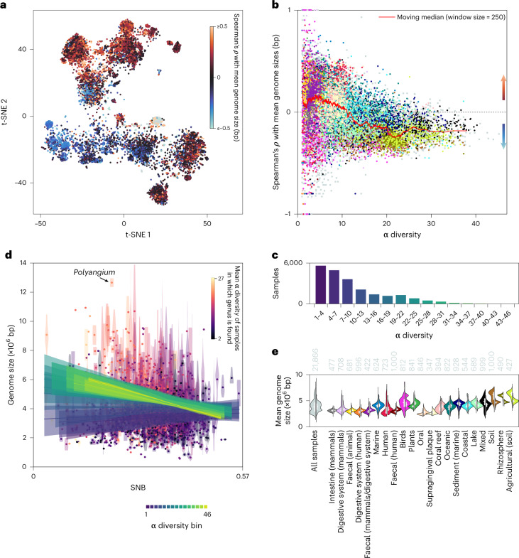
Fig. 4. Contrasting genomic niche range strategies.
a, Spearman’s rank correlation coefficient (ρ) per sample between SNB and mean genome size on the rank genus plotted on the t-SNE (Fig. 1d). Positive values indicate an association with social generalists and negative values indicate an association with social specialists. b, ρ as a function of the α diversity of the sample. The colour coding represents annotated biomes (see e). c, Number of samples per bin of α diversity. d, SNB versus genome size on the rank genus. The violin plots show the distribution of genome sizes of species within a genus and the dots represent mean values. The lines depict the mean of linear regression lines between SNB and mean genome size of all samples in a specific bin of α diversity. The shaded areas show the interquartile range of the regression lines. e, Violin plots depicting the distribution of mean genome size of the top 25% social specialist taxa (left) and top 25% social generalist taxa (right) within a sample across all samples or those from the annotated biomes with the most samples. The annotated biomes are arranged according to mean α diversity. The numbers at the top of the violin plots show the sample size. The lines within the violin plots show the interquartile range and median. Supporting data relating to a and b are available in Supplementary Data 6.

