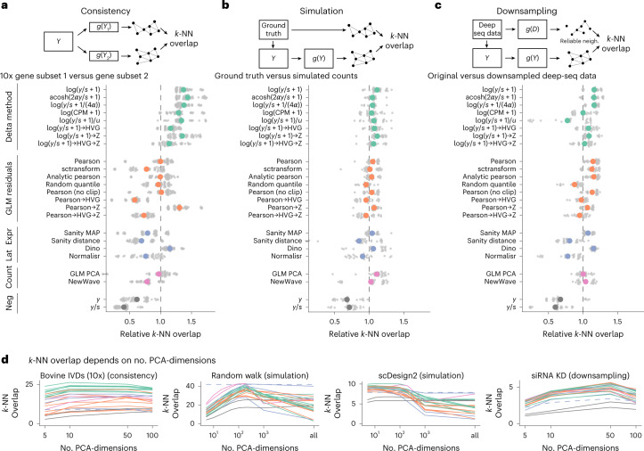
Fig. 2. Benchmark results.
a, Overlap between the k-NN inferred separately on two halves of the data. The colored points show the averages across ten datasets, each with five replicate random data splits (small, gray points). b, Overlap between k-NN inferred from simulated data and ground truth, using five simulation frameworks and five replicates per framework. c, Overlap between a reference k-NN graph (inferred using all transformations on deeply sequenced data and taking the intersection) and the k-NN inferred on data downsampled to match typical 10x data (5,000 counts per cell) for five datasets with five replicates each. To compare and aggregate results across the different datasets, Relative overlap (a–c), which was computed by dividing, for each dataset, the overlap by its average across all transformations, fixing k = 50 and using a dataset-specific number of PCA dimensions (Extended Data Fig. 7 shows the underlying, unaggregated data). d, Overlap (y axis) as a function of PCA dimensions (x axis); the different transformation types are indicated by the colors, using the same palette as in a–c. The performance of Sanity Distance is shown as a dashed line. Source data are provided.

