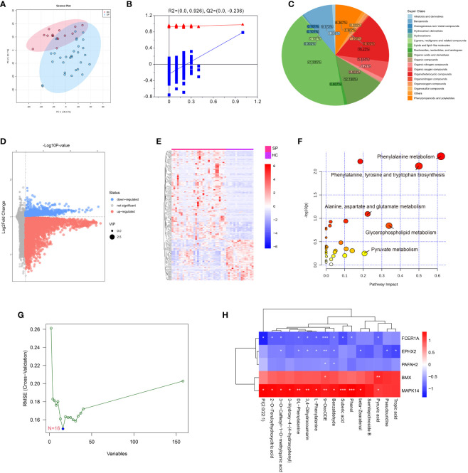
Figure 7.
Metabolomics profiling of healthy control and sepsis patients. (A) Principal component analysis (PCA) scores plot for metabolomics analysis in sepsis and control. (B) OPLSDA plot. The ordinate represents the value of R2Y or Q2, the abscissa represents the degree of substitution retention, the red dot represents the R2Y value of the substitution test, the blue dot represents the Q2 value of the substitution test, and the two dashed lines represent the regression lines of R2Y and Q2, respectively. (C) Pie chart analysis of differentially-expressed metabolites categories. Each color represents a different category of substances. (D) Volcano plot, and (E) Heat map analyzed by TBtools showing the significantly changed metabolites in sepsis and control. (F) Bubble plot of enriched pathways of differentially-expressed metabolites. Each bubble represents a metabolic pathway, with the position and size of the bubble indicating the impact of the pathway in the topological analysis. The color of the bubble indicates the P-value, with redder colors indicating smaller P-value and more significant enrichment. (G) Support vector machine (SVM) for hub metabolites, the optimal variables were screened out based on the “e1071” package. (H) Person’s correlation analysis between hub metabolisms and identified hub genes. *: as compared with the Control group, P <0.05; **: as compared with the Control group, P <0.01; ***: as compared with the Control group, P<0.001.

