. 2023 May 11;131(5):057004. doi: 10.1289/EHP11882

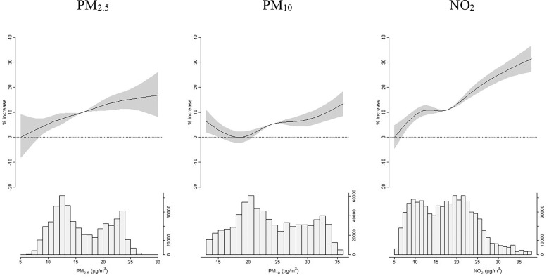
Figure 3.

Figure 3 is a set of three parts. Under each part, there is one ribbon and line graph and one histogram. From left to right, the graphs are titled particulate matter begin subscript 2.5 end subscript, particulate matter begin subscript 10 end subscript, and Nitrogen dioxide. The ribbon and line graphs are plotting percentage increase, ranging from negative 20 to 40 in increments of 10 (y-axis) across air pollutants concentrations (x-axis), respectively. The histograms are plotting air pollutants’ distributions, ranging from 0 to 20000 in increments of 20000 and 20000 to 60000 in increments of 40000; 0 to 60000 in increments of 20000; and 0 to 10000 in increments of 10000 and 10000 to 30000 in increments of 20000 (y-axis) across particulate matter begin subscript 2.5 end subscript (microgram per meter cubed), ranging from 5 to 30 in increments of 5; particulate matter begin subscript 10 end subscript (microgram per meter cubed), ranging from 15 to 35 in increments of 5; Nitrogen dioxide (microgram per meter cubed), ranging from 5 to 35 in increments of 5 (x-axis), respectively.

Exposure–response functions: percentage increase in case–fatality risk (%IR), and 95% confidence intervals (95% CI), per increasing levels of air pollutants, from natural spline models. Italy, 20 February 2020–15 June 2021 (n=3,995,202 COVID-19 cases, n=124,346 deaths). Relevant data in Excel Table S2. Y axes of the top graphs display percentage increases of risk, x axes of the top graphs report air pollutants concentrations. Bottom graphs show histograms of air pollutants’ distributions. Results from the main model, adjusted for interaction terms between month, province, age, sex, and ventiles of the generalized propensity score.