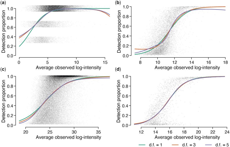
Figure 1.
The proportion of detected values increases with the average intensity of each peptide precursor. Panels (a)–(d) show scatter plots for Datasets A–D. The x-axis shows average log2 observed intensity for each precursor. The y-axis shows the proportion of detected (non-missing) values for each precursor. The number of samples is (a) , (b) , (c) , and (d) . Jittering is added to the detection proportions in (a) and (c) to reduce over-plotting. Natural cubic splines were fitted to the logit proportions with 1, 3, or 5 degrees of freedom (df).

