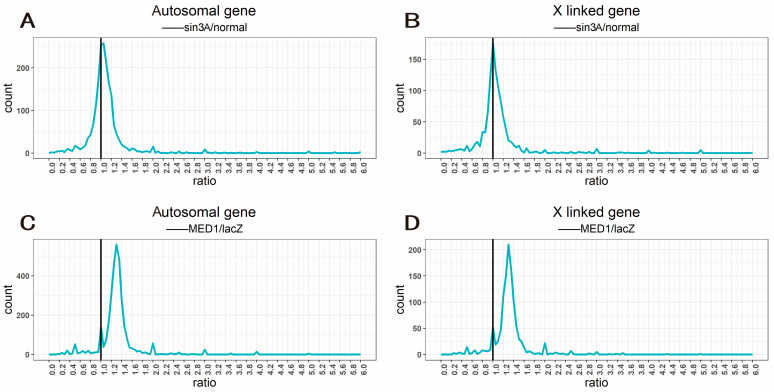
Figure 5.
Ratio distribution of gene expression of candidate target gene mutants. (A,B) Ratio distribution of gene expression of Sin3A knockdown mutants, with wild type as the control group; all genes are divided into autosomal genes (A) and X linked genes (B) according to their positions on chromosomes. (C,D) Ratio distribution of gene expression of MED1 knockdown mutants, with RNAi-mediated knockdown of exogenous E. coli LacZ gene as a control; all genes are divided into autosomal genes (C) and X linked genes (D) according to their positions on chromosomes. The ratio distribution map was plotted using the geom_freqpoly () function in the ggplot2 package. The horizontal axis represents the ratio of gene expression values compared to the control group, and the vertical axis represents the frequency ratios that fall into each bin of 0.05. The vertical black solid line represents the ratio 1.0 (no change).

