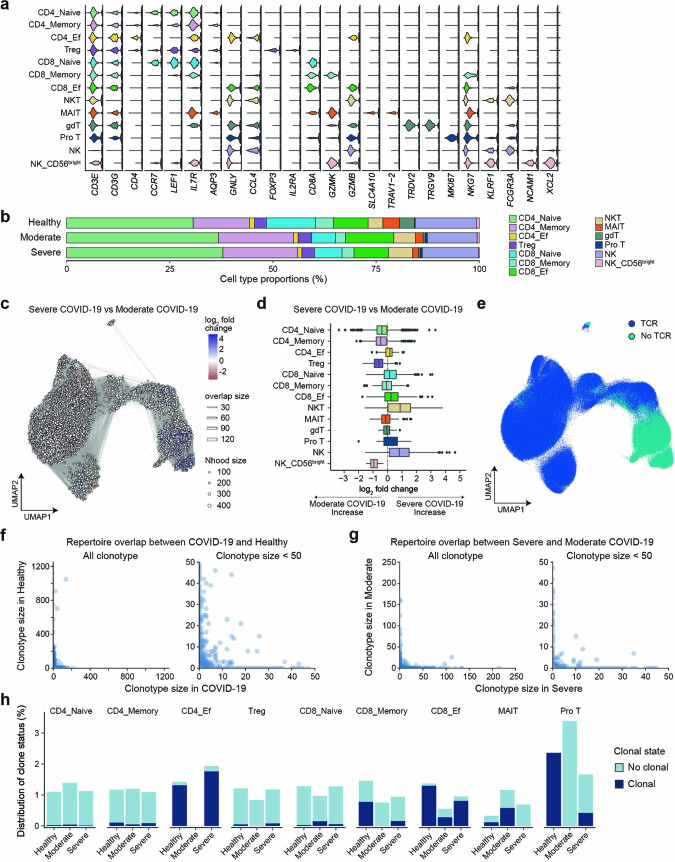
Extended Data Fig. 3. Immunological features of T cells and NK cells and TCR analysis.
(a) Violin plots showing the expression distribution of selected canonical cell markers in 13 clusters. The rows represent clusters and the columns represent selected marker genes. (b) A bar plot of the proportion of cell types, separated by three conditions (n = 75 healthy, n = 9 moderate, n = 64 severe). (c) Graph representation of neighborhoods identified by Milo in COVID-19 patients. Nodes are neighborhoods, colored by their log2 fold change between moderate (n = 8) and severe (n = 64) COVID-19 patients adjusted by age, sex, time since symptom onset and duration of systemic steroids treatment. Nhood, neighborhood. (d) Box plot showing the distribution of adjusted log2 fold change in abundance between moderate and severe COVID-19 in neighborhoods according to 13 cell types. Boxes denote the interquartile range (IQR), and the median is shown as horizontal bars. Whiskers extend to 1.5 times the IQR, and outliers are shown as individual points. (e) UMAP embedding of TCR detection. (f) Repertoire overlap according to clonotype size between COVID-19 (n = 73) and healthy controls (n = 75) in all clonotypes (left) and in clonotypes with size < 50 (right). (g) Repertoire overlap according to clonotype size between moderate (n = 9) and severe (n = 64) group in all clonotypes (left) and in clonotypes with size < 50 (right). (h) The distribution of the clonal state of T cells which were suspected to be specific to SARS-CoV-2 based on CDR3 amino acid sequence in each cluster according to disease status (n = 75 healthy, n = 9 moderate, n = 64 severe).

