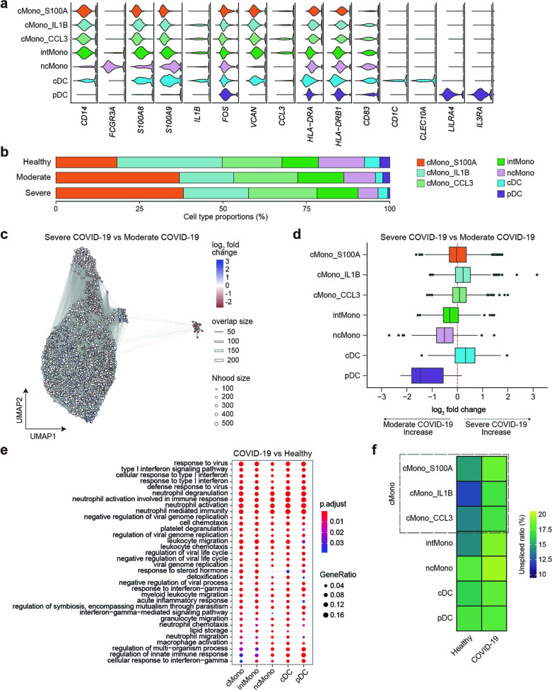
Extended Data Fig. 2. Immunological features of monocytes and dendritic cells.
(a) Violin plots showing the expression distribution of selected canonical cell markers in the seven clusters. The rows represent clusters and the columns represent selected marker genes. (b) A bar plot of the proportion of cell types, separated by three conditions (n = 75 healthy, n = 9 moderate, n = 64 severe). (c) Graph representation of neighborhoods identified by Milo in COVID-19 patients. Nodes are neighborhoods, colored by their log2 fold change between moderate (n = 8) and severe (n = 64) COVID-19 patients adjusted by age, sex, time since symptom onset and duration of systemic steroids treatment. Nhood, neighborhood. (d) Box plot showing the distribution of adjusted log2 fold change in abundance between moderate and severe COVID-19 in neighborhoods according to seven cell types. Boxes denote the interquartile range (IQR), and the median is shown as horizontal bars. Whiskers extend to 1.5 times the IQR, and outliers are shown as individual points. (e) The top 20 enriched biological processes by GO analysis of upregulated DEGs of COVID-19 (n = 72) compared to healthy controls (n = 75) in five cell types. Dot color indicates the statistical significance of the enrichment (adjusted P-values via the Benjamini-Hochberg method), and dot size represents gene ratio annotated to each term. (f) Heatmaps depicting the average unspliced ratio of seven cell types stratified by COVID-19 (n = 73) and healthy controls (n = 75).

