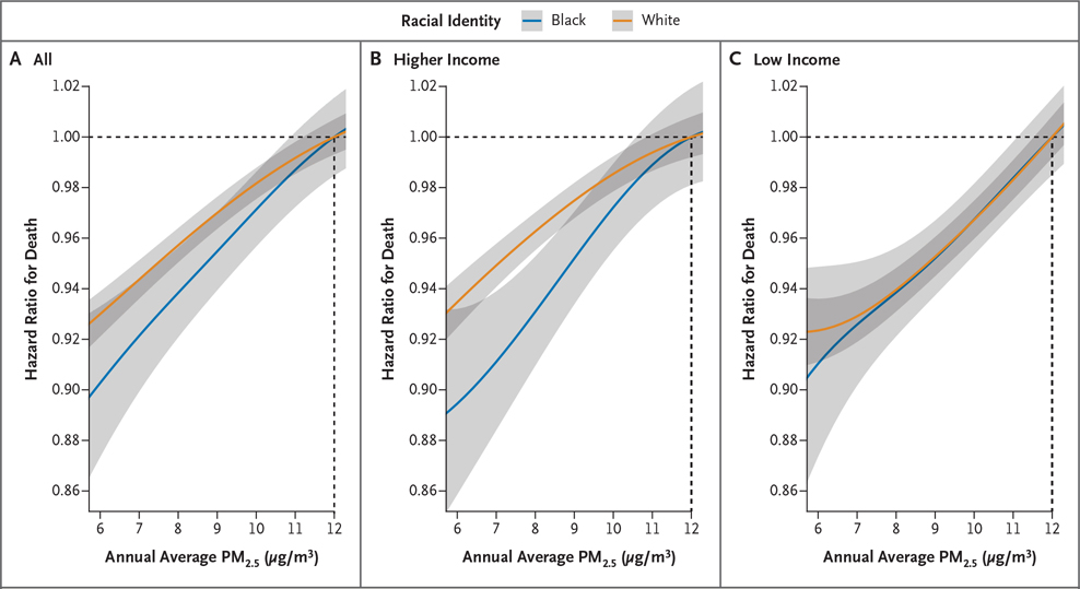
Figure 3. Exposure–Response Curves for PM2.5 Exposure and Mortality among Marginalized Subpopulations.
Shown are point estimates (solid lines) and 95% confidence intervals (gray shaded areas) of the hazard ratio for death corresponding to decreases in annual average PM2.5 exposure (to 6 to 11 μg per cubic meter) with respect to 12 μg per cubic meter on average for subpopulations defined in selected ways. Estimates below 6 μg per cubic meter are not shown in order to focus attention on plausible ranges for PM2.5 pollution policy. In all panels, curves for Black persons are blue and White persons are orange. Panel A defines persons according to racial identity only without regard to income. Panel B includes only higher-income persons. Panel C includes only low-income persons. Low income was defined as dual eligibility for both Medicare and Medicaid. Confidence intervals were not adjusted for multiplicity; therefore, they should not be used in place of hypothesis testing.

