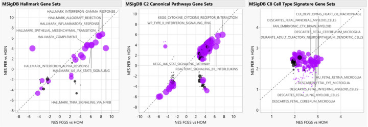
Figure 3. Functional enrichment analyses.
The scatterplots depict normalized enrichment scores (NES) as calculated by GSEA, for represented gene sets from MSigDB for analyses of FCGS vs HOM (i.e., FDR q-value<0.05, × axis) and comparison to PER vs HGIN (Y axis). Gene sets differentially enriched or depleted (i.e., FDR q-value<0.05) in FCGS compared to PER appear in purple. For all graphs, relevant gene sets and pathways are labeled. The size of the dots is based on log10 transformed p-values based on enrichment scores comparison of FCGS vs PER.

