
Fig. 5.
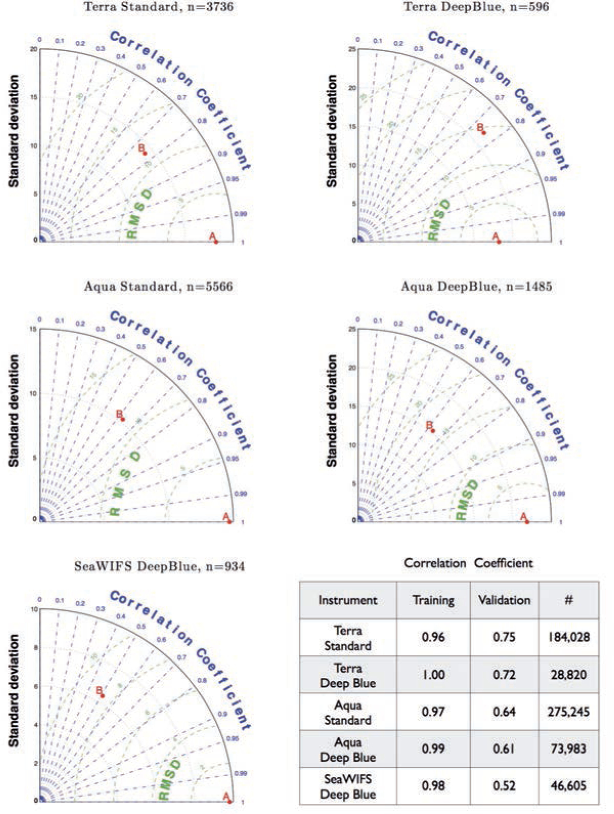
Taylor diagrams quantify the similarity between the fit and observations and the amplitude of their variations, i.e. the similarity between fit and observations based on the correlation coefficient and the centred RMS difference on the one hand, and the amplitude of their variations using the standard deviation on the other. In each case, the observations are denoted by point A on the x-axis. The green contours around A show the centred RMS differences between fit and observations. The radial distance of a point from the origin is proportional to the amplitude of variation quantified by the standard deviation. Points lying on a radial arc, at the same distance from the origin as point A, have the same standard deviation indicating that the simulated variations have the correct amplitude.