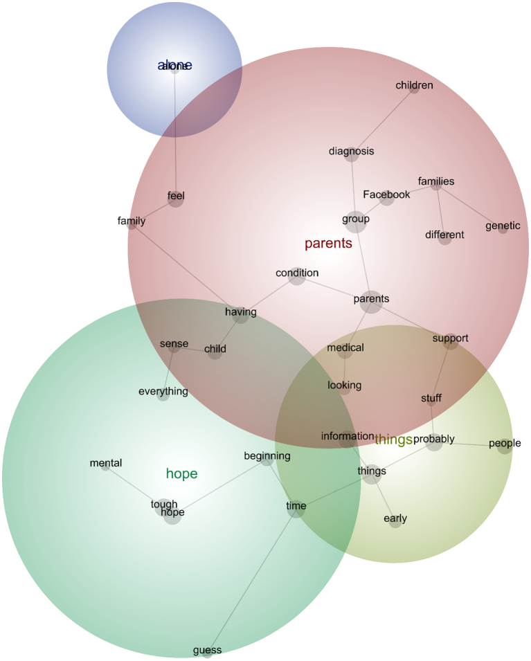
Fig. 2.
Discovery Mode Concept Map. The components of these concepts are ordered within a thesaurus and weightings to indicate relative importance. Within the map, connections between concepts are represented by grey lines. Clusters of concepts within a map – known as themes – suggest contextual similarity [36]. For clarity, themes are colour-coded to signify those that are (and are not) important, whereby the ‘most important theme appears in red, and the next hottest in orange, and so on according to the colour wheel’. [20]

