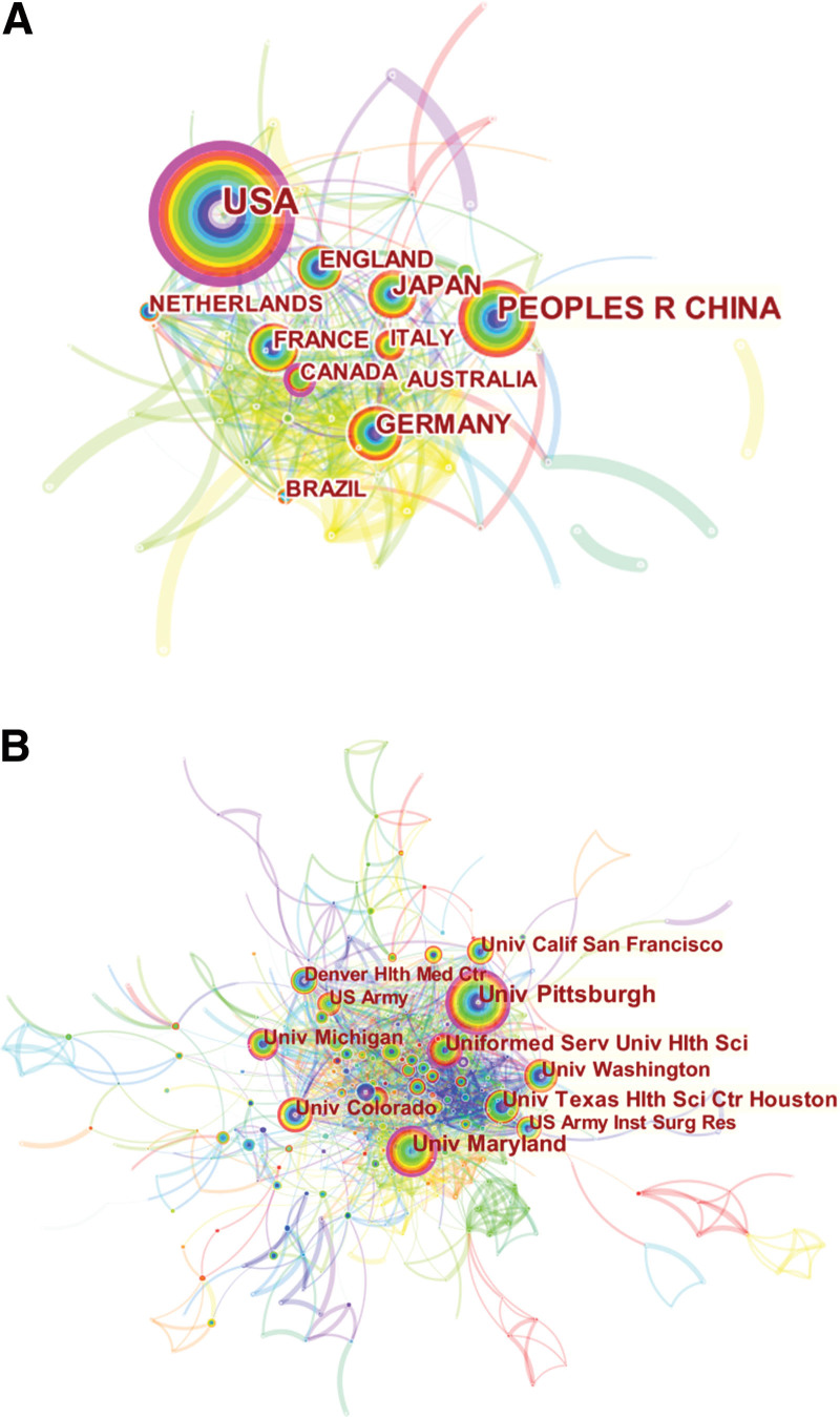
Figure 4.
Spatial distribution map of (A) countries/regions and (B) institutions. Each circle in the diagram represents a nation/institution, with the size of the circle indicating the published outputs of the country/institution. The lines that connect the circles represent international collaboration, and the broader the lines, the closer the cooperation. The colors of the nodes and lines represent different years; the warmer the color, the more recent the publication. The purple circle indicates high centrality.

