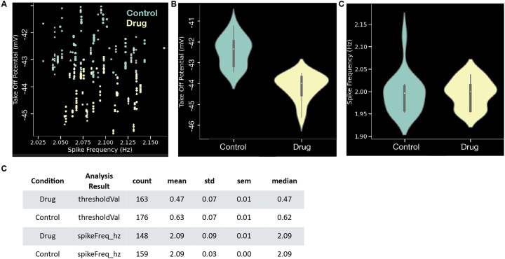
Figure 4. Plugin to pool analysis across files.
(A) A pooled plot of take off potential (mV) versus spike frequency (Hz). Each symbol is the value for one AP and markers denotes different recordings. Colors denote two different conditions (control and drug). (B) Violin plot of take off potential (mV) comparing control to drug conditions. (C) Violin plot of spike frequency (Hz) comparing control to drug conditions. (D) Tabular summary of the plots in panels B-C. All plots in these examples are from the same synthetic dataset with 32 recordings and 339 APs.

