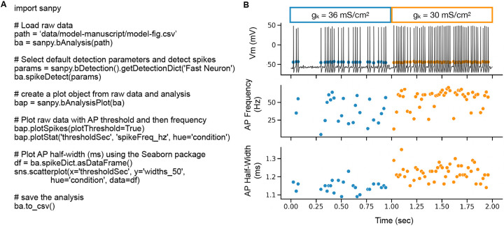
Figure 5. Programming with the API.
(A) Example Python script to load raw data, detect APs, plot raw data with an overlay of the analysis results, and to save the results to a CSV file. (B) Output of the script in (A). Top plot is the raw recording overlaid with AP threshold (mV). Middle plot is AP frequency (Hz) versus time (s). Bottom plot is AP 50 % half-width (ms) versus time (s). Each AP is a symbol (circle). The color of the symbols indicates different conditions within the recording. Here, this represents a change in the maximal conductance of the K+ leak channel (gK) indicated by blue and orange symbol colors. Please note, all data in this figure is from a stochastic Hodgkin-Huxley neuron model.

