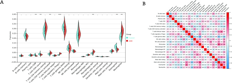
Figure 6. Immune infiltration analysis.
(A) Split violin plot of the estimated proportion of 22 types of immune cells between control and AMI using the dataset of GSE24519. (B) Correlation heat map of 22 types of immune cells. Positive and negative correlations were respectively shown in blue and red color, whereas the number represented the correlation parameters. ∗∗P < 0.01, ∗∗∗P < 0.001 compared with control for two groups.

