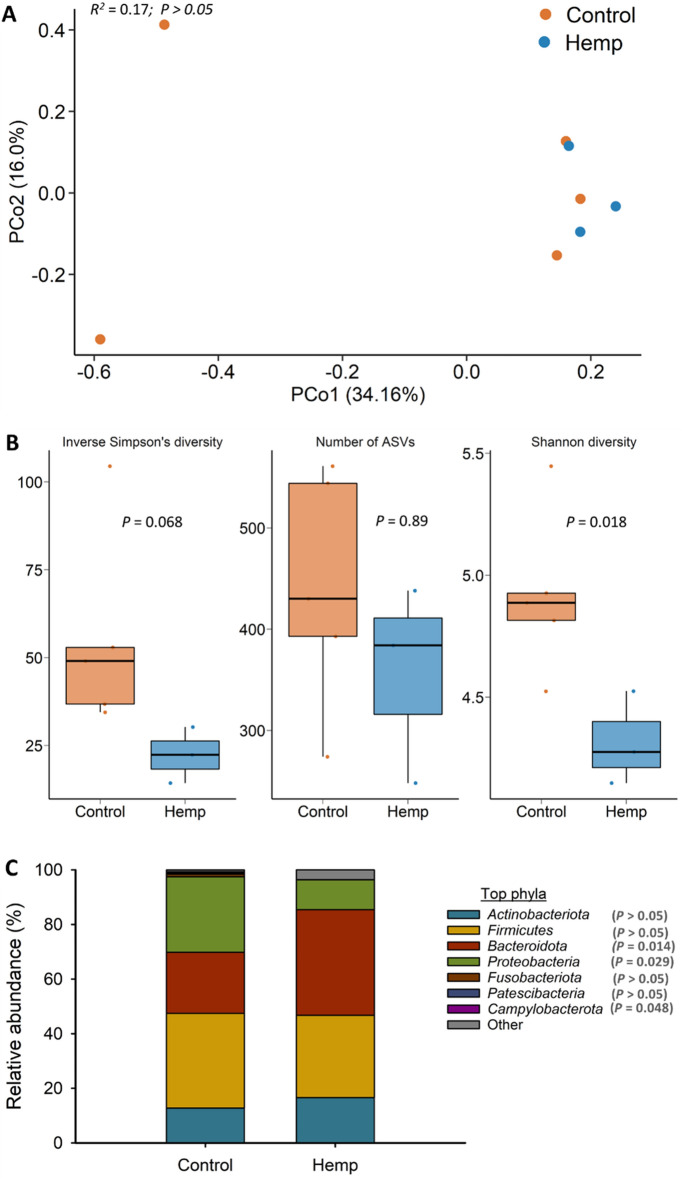
Figure 7.
(A) Principal coordinates analysis (PCoA) plot of the Bray–Curtis dissimilarities of the uterine microbiota. The percentage of variation explained by each PCoA is indicated on the axes; (B) Box and whisker plot of the number of ASVs and the Shannon and inverse Simpson’s diversity indices for the uterine microbiota by diet on d 112 (slaughter). The box indicates the interquartile range (IQR) (middle 50% of the data), the middle line represents the median value, and the whiskers represents 1.5 times the IQR; (C) Stacked bar chart of the 7 most relatively abundant bacterial phyla in uterine microbiota by diet; Control refers to the group of heifers that received 20% DDGS in their diet (n = 5) and Hemp refers to the group that received 20% hempseed cake inclusion diet (n = 3).

