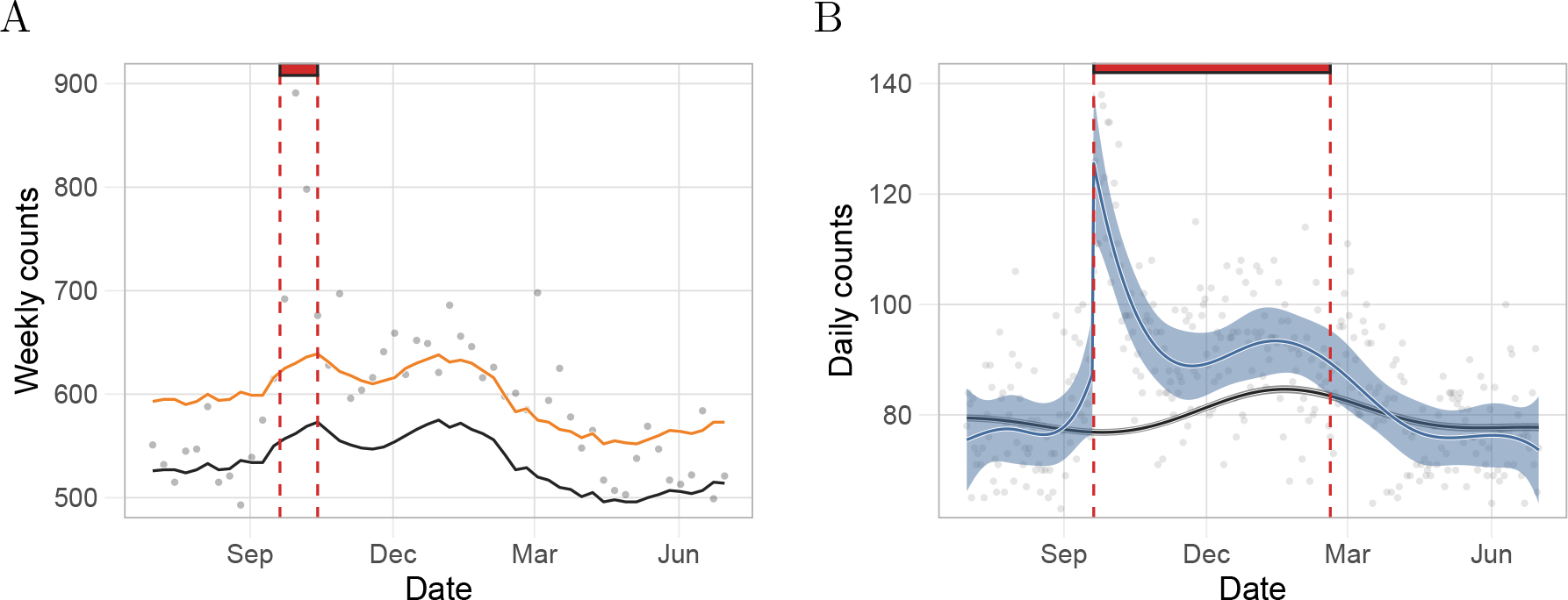
Figure 1:

Comparison of our approach to the Farrington model based on estimates for Puerto Rico from a period including Hurricane Maria. A) Gray points represent weekly deaths counts used by CDC. The black and the orange curves are the expected number of daily counts and the threshold for significant excess deaths, respectively, as defined by the Farrington algorithm. The red rectangle denotes the number of consecutive days with excess deaths since the landfall of Hurricane Maria as determined by the Farrington algorithm. B) Gray points represent daily death counts. The black curve is the estimated expected counts based on our method and the blue curve represents the event effect estimate, . The black and blue ribbons are point-wise 95% confidence intervals for the expected counts and event effect, respectively. Finally, the red rectangle is as in A) but for our method.
