
FIGURE 2. Evaluation of posterior inclusion probabilities (PIPs).
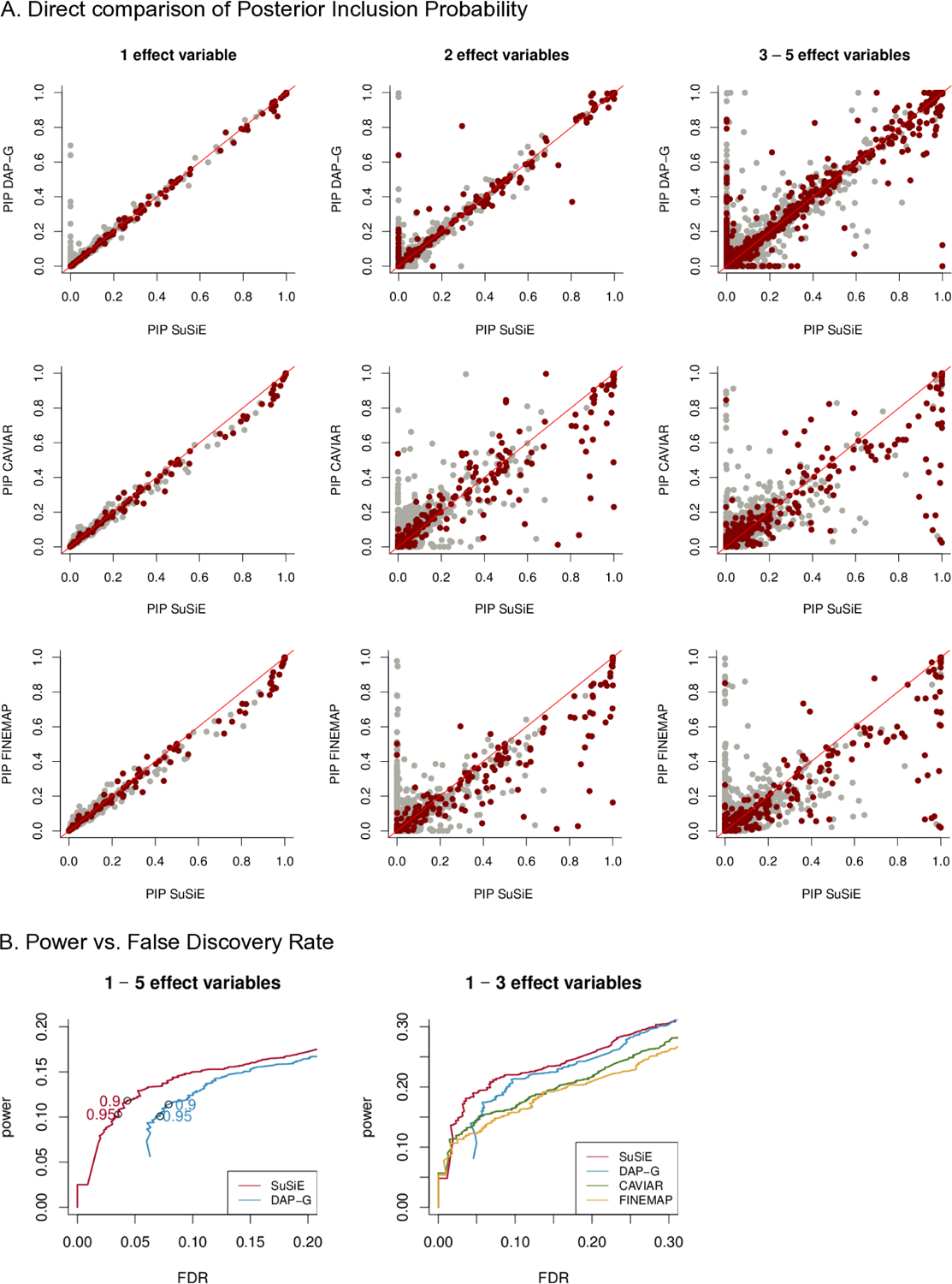
Scatterplots in Panel A compare PIPs computed by SuSiE against PIPs computed using other methods (DAP-G, CAVIAR, FINEMAP). Each point depicts a single variable in one of the simulations: dark red points represent true effect variables, whereas light gray points represent variables with no effect. The scatterplot in Panel B combine results across the first set of simulations. Panel B summarizes power versus FDR from the first simulation scenario of. These curves are obtained by independently varying the PIP threshold for each method. The open circles in the left-hand plot highlight power versus FDR at PIP thresholds of 0.9 and 0.95). These quantities are calculated as (also known as the “false discovery proportion”) and , where FP, TP, FN and TN denote the number of False Positives, True Positives, False Negatives and True Negatives, respectively. (This plot is the same as a precision-recall curve after reversing the x-axis, because , and recall = power.) Note that CAVIAR and FINEMAP were run only on data sets with 1 − 3 effect variables.