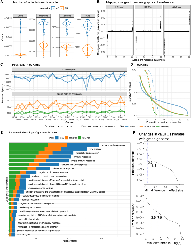
Figure 3.
Genome graphs with millions of variants impact downstream results
(A) Number of SNVs, insertions, deletions, and MEIs in the cohort graph for each sample.
(B) Changes in the distribution of read mapping quality when using a cohort genome graph relative to the reference genome. Each point is an individual sample.
(C) The number of H3K4me1 graph-only, ref-only, and common peaks between the cohort and the reference genome graphs, stratified between flu-infected and non-infected (NI) read sets.
(D) Inverse cumulative distributions describing how many peaks are observed in more than a number of samples. Curves that are expected by chance are also shown (dashed lines).
(E) Immune-related Gene Ontology descriptions of genes within 10 Kbp of graph-only peaks. One gene may contribute multiple descriptions.
(F) Distributions showing how caQTL effect sizes and p values (infected condition) changed when we used a genome graph instead of the reference genome. First and second vertical lines mark the 99th and 99.9th percentiles.

