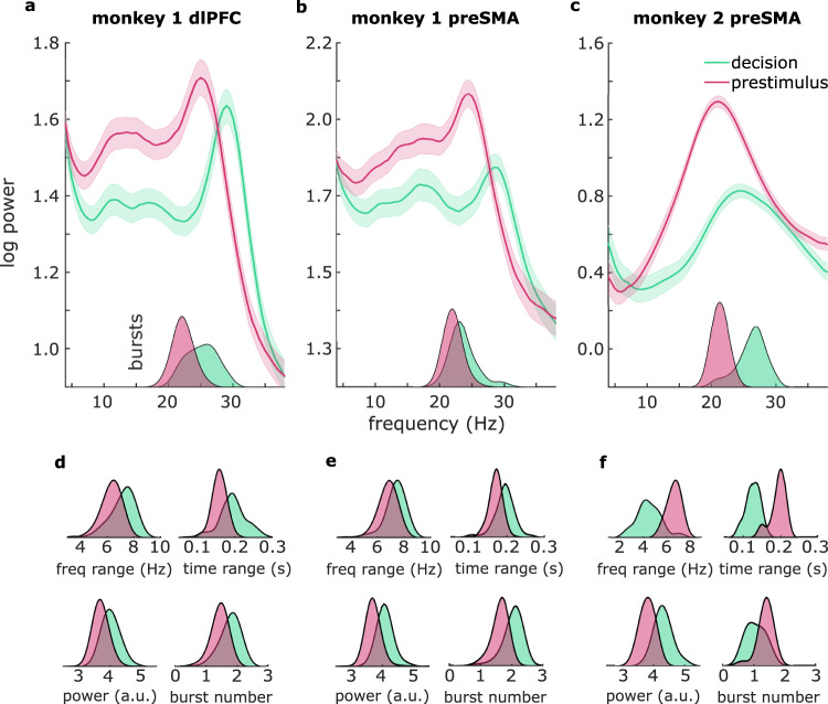
Fig. 2. Frequency shift and distinct burst profiles between prestimulus and decision intervals.
a Spectral power (line graphs) and burst frequency (density plots in insets) during decision (green) and prestimulus delays (pink) in monkey 1 dlPFC, b monkey 1 preSMA, and c monkey 2 preSMA. Shaded regions around the line graphs represent the standard error of the mean. d Density plots represent burst frequency range, time range, power, and number in monkey 1 dlPFC, e monkey 1 preSMA, and f monkey 2 preSMA. Source data are provided as Source Data files.

