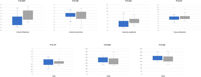
Figure 2.
Box and whisker plots showing analyzed DVA measurements in patients and controls. Each box shows median (central horizontal line), mean (cross within the box) and interquartile range (horizontal extremes of the box) values for each variable. The ends of the whiskers represent the minimum and maximum values. Dots not included in whiskers represent outliers. Each graph (blue for ED patients and gray for healthy controls, respectively) shows values of a different metric in each of the two groups. P-values for each comparison are reported. Details on pairwise comparisons are presented in Table 2.

