
FIGURE 1.
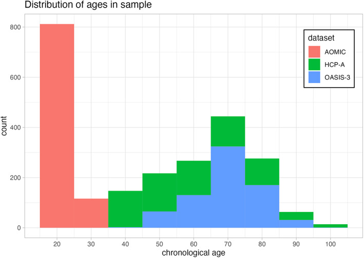
Distribution of participant age for the different projects we leveraged in our analyses. The horizontal axis depicts participant age in years, while the vertical axis shows the number of participants within a given age bin. Each dataset is shown in a different color, with AOMIC shown in red, HCP‐A shown in green, and OASIS‐3 shown in blue.