
FIGURE 3.
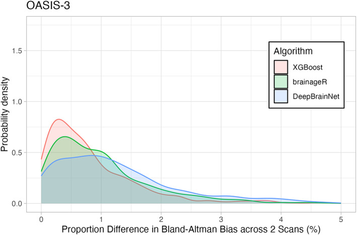
Density Plot of Differences in 3 Brain Age Algorithms across the OASIS sample. The horizontal axis shows the portion of differences between repeated scans (as a percentage). The vertical axis is the density (or frequency) of such bias. Each brain age algorithm is shown in a different color with XGBoost shown in light red, brainageR shown in light green, and DeepBrainNet shown in light blue.