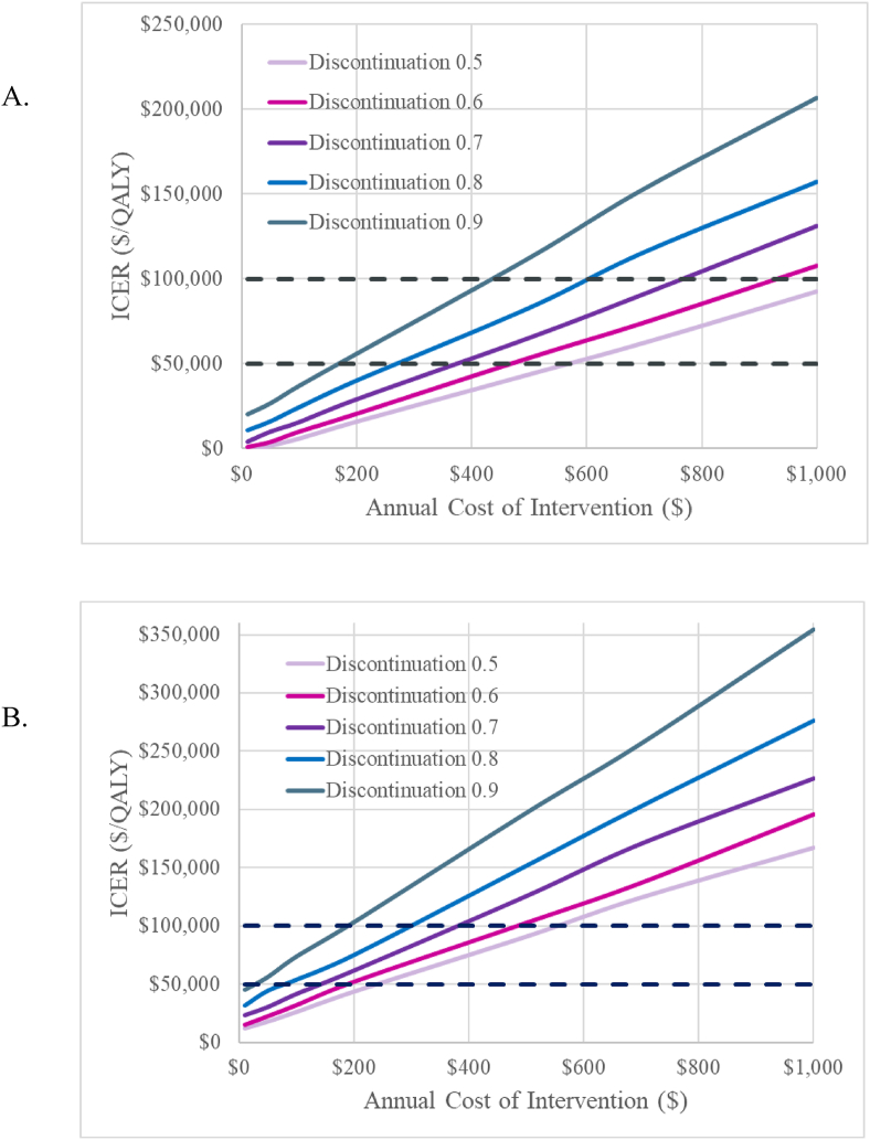
Fig. 1.
Scenario Analysis Results. Graph A shows results for the cohort consisting of inactive and insufficiently active individuals. Graph B shows results for the cohort consisting of individuals in any activity group. The distinct traces depict lower discontinuation rates than in the base case (e.g., 90% of base case, 80% of base case, etc.). At a given discontinuation rate, this figure depicts the additional amount of money (in 2020 USD) that can be invested into the program while maintaining ICERs below a given threshold. Willingness-to-pay thresholds of $50,000 and $100,000 are shown with dotted black lines.

