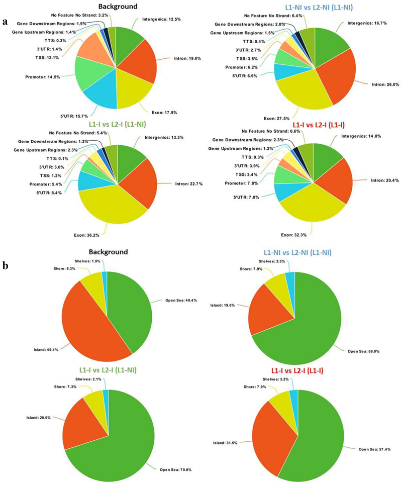
Figure 2.

Pie charts showing the distribution of DMCs for all three comparisons: 1st lactation (n = 7) vs. 2nd lactation (n = 7) (blue), 1st (n = 5) vs. 2nd lactation with inflammation (n = 5) (green), and 1st (n = 5) vs. 2nd lactation with inflammation and previous inflammation history (n = 7) (red). Distribution is shown according to gene regions (a), CpG density (b), and repeats (c). All three comparisons are discussed in comparison to the background (control comprised of all CpGs found after RRBS analysis).
