
Figure 2.
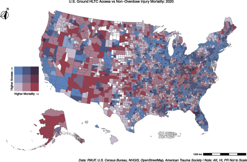
Bivariate map comparing tertiles of county-level HLTC coverage and nonoverdose injury mortality. Counties with increased coverage are lighter blue, and those with higher injury mortality are darker red. Counties with high injury mortality and low HLTC coverage will be only dark red, while those with high coverage and low mortality will be only light blue. Counties falling in the middle are categorized by the respective hue in the legend.