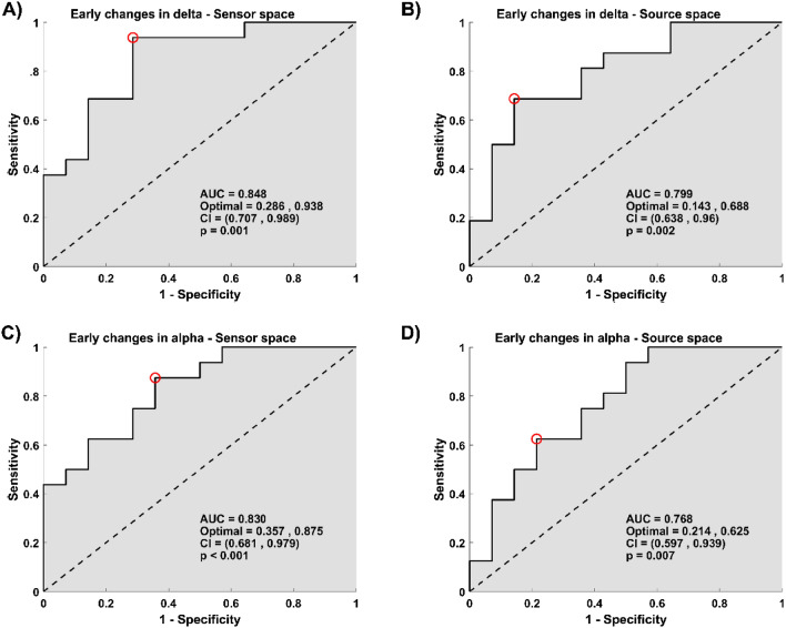
Figure 4.
Early changes in the delta and alpha relative power bands predict improvement in depressive symptoms. (A,C) The plots depict the ROC curve across all possible threshold values of the predictor for average power relative value within the clusters found in the delta band (A), and in the alpha band (C) at the sensor space. (B,D) The plots depict the ROC curve across all possible threshold values of the predictor for average power relative value in the delta band (B) and the alpha band (D) across regions found significant at the source space. (A–D) In all plots, x-axes represent false positive rates (1-specificity), y-axes the true positive values (sensitivity). Here, specificity corresponds to the percentage of non-responders who were predicted to be non-responders, and sensitivity corresponds to the percentage of responders who were predicted to be responders. The red circle shows the optimum operating point of the ROC curve.

