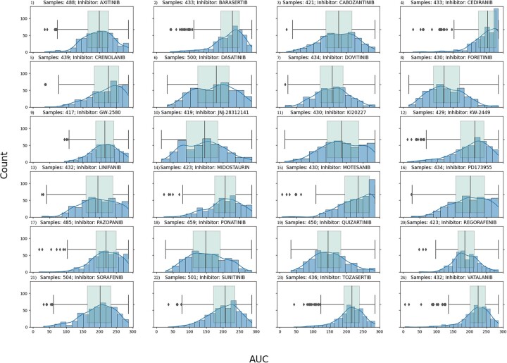
Fig. 1.
Quartile analysis for responder versus non-responder. This figure shows the drug response AUC distribution of the 24 RTK-type-III inhibitors in the form of blue histogram plots. Overlaid on top of the histogram is also green box-whisker plot of the same distribution. Each plot is titled with the name of its given inhibitor. The y-axis is the drug response AUC score for the histogram bin, and the x-axis is the count, or number of samples that fall in the bin. We can see that some of the distributions are skewed. The ones skewed towards the left correspond to drug therapies where most patients responded positively, whereas the ones skewed towards right are for drug therapies where most patients did not respond. Some drug therapies have a normal distribution where there is no disproportion of patients that responded well or not. By focusing on the tails of the distribution by looking at the box-whisker, the patients can be classified as low/high responders depending on which tail (low → right, high → left) side they fall into

