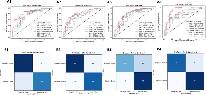
Fig. 3.
ROC–AUC curves and CM (SHAP + RF) for the top 4 RTK-type-III Inhibitor models. The top 4 performing RTK-type-III inhibitor models are assigned to a number as follows (1—Crenolanib, 2—Dasatinib, 3—Dovitinib, 4—Foretinib) (A) For each inhibitor, a ROC-AUC plot was generated. The ROC-AUC plots consist of ROC curves for nine different feature selection + classification combinations. The baseline (50% AUC) is represented with a blue-dashed line. For all the plots, the x-axis is 1—specificity, also called the false positive rate or fall-out and the y-axis is the sensitivity, also known as true positive rate or recall. The performance for each given model varies depending on the inhibitor chosen. (B) For each inhibitor, a CM plot was generated using the predicted outcomes from the SHAP + RF model combination. The CM plots consist of (Read from left to right, from top to bottom) the true negative, false negative, false positive and true positive values calculated by comparing the predicted classification assignments (y-axis, ‘Predicted Label’) versus the true classification assignments (x-axis, ‘True Label’). The squares of the CM plots are color coded in blue, where the shade of the color changes depending on the proportion of the samples that fall in the square (darker = more samples, lighter = less samples

