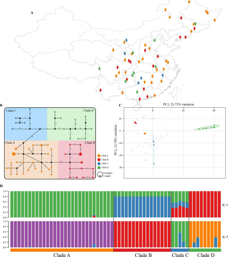
Fig. 4.
Population structure of L. japonicus accessions. (A) Geographic distribution of the sampling locations. Different colors represent different subclades. The map plot was generated using ArcGis 10.8. (B) TCS network for all 59 accessions. Missing haplotypes are indicated by black dots and mutational steps are indicated by numbers. (C) PCA of L. japonicus accessions; the proportion of the variance explained was 23.73% for PC1 and 12.74% for PC2. (D) STRUCTURE analysis for K = 3 and 5. Colors indicate different clusters. The x-axis shows the subclades, and the y-axis indicates the probability of inferred ancestral lineages

