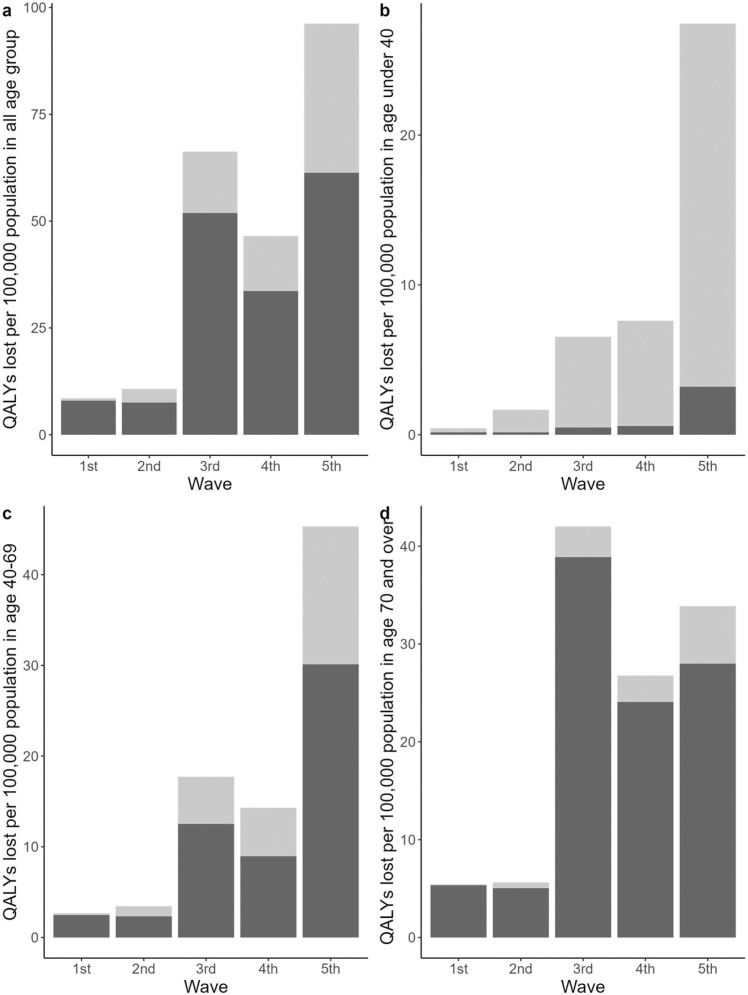
Fig. 3.
Comparison of QALYs lost per 100,000 population in each epidemic wave. Wave 1; 01/01/2020–05/31/2020, Wave 2; 06/01/2020–10/31/2020, Wave 3; 11/01/2020–03/31/2021, Wave 4; 4/1/2021–6/30/2021, Wave 5; 7/1/2021–12/31/2021. Light grey bars represent QALYs lost due to morbidity and dark grey bars represent QALYs lost due to mortality. QALYs; Quality-adjusted life years. Panel a: Disease burden in total population. Panel b: Disease burden in population under 40. Panel c: Disease burden in population between age 40 and 69. Panel d: Disease burden in population 70 and over.

