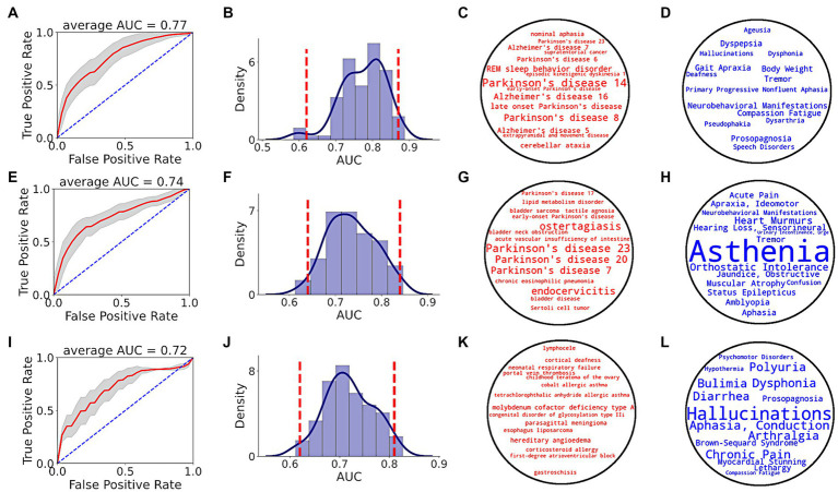
Figure 5.
PD prediction using SPOKE based model. Each row in the figure corresponds to a single time period, i.e., EHR data from at least 1 (A–D), 3 (E–H) and 5 (I–L) years prior to index date. (A,E,I) show ROC performance curves of random forest classifiers across respective time periods, with red curve depicting the average ROC curve, gray shade showing ± standard deviation, and blue dotted line representing the random guess curve. Average AUC of each ROC curve is shown at the top of each box. (B,F,J) show AUC distributions of classifiers across respective time periods. Vertical red dotted lines indicate 95% confidence interval of each AUC distribution. (C,G,K) show top 15 disease nodes, and (D,H,L) show top 15 symptom nodes, for patient classification across respective time periods, with word size proportional to feature importance.

