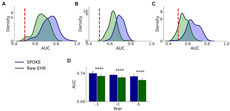
Figure 6.
Comparative analysis of PD prediction between SPOKE and raw EHR data. Distributions of classification AUC scores between SPOKE (blue) and raw EHR (green) across −1, −3 and −5 year time periods are shown in (A–C) respectively. Vertical red dashed line indicates an AUC score of 0.5 which corresponds to random guessing. (D) shows a bar graph with mean and standard deviation of AUC distributions for SPOKE (blue) and raw EHR (green) across time periods shown along the x-axis. Asterisks in the graph indicate p value significance of ≤0.0001.

