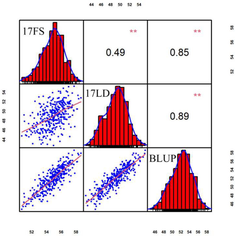
Figure 1.
Scatterplots, frequency distribution histogram and correlation of 17FS, 17LD and BLUP. The histograms on the diagonal represent the phenotypic distribution frequency, the values above the diagonal represent the Pearson’s correlation coefficient between adjacent environments, and the scatterplots below the diagonal represent the degree of data fit. The values in the outer circle represent the range of phenotype values in the corresponding environment. ** indicates statistical significance with p < 0.01 significant.

