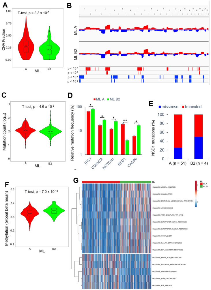
Figure 4.
Differences in the mutational landscape, global DNA methylation, and gene regulatory networks between ML A and ML B tumors. (A) Violin plot demonstrates a significant difference in the fraction of altered genome between ML A (red) and ML B2 (green) tumors. (B) CNA plots illustrate copy number gains (red) and losses (blue) for ML A and ML B2 tumors and demonstrate hot-spot regions with significant differences as calculated by Fisher’s exact test. (C) Violin plot demonstrates a significant difference in somatic mutation counts between ML A (red) and ML B2 (green) tumors. (D) Bar plot shows MutSig genes with a significant difference in somatic mutation frequency between ML A (red) and ML B2 (green) tumors. (E) Bar plot shows the relative frequency of tumors with either missense (blue) or truncating (red) NSD1 mutations for ML A and ML B2 tumors. (F) Violin plot demonstrates a significant difference in global DNA methylation between ML A (red) and ML B2 (green) tumors. (G) Heatmap illustrates an unsupervised hierarchical clustering based on GSVA scores for indicated HALLMARK gene sets from MSigDB. * p < 0.05, ** p < 0.005 as determined by a chi-square test.

