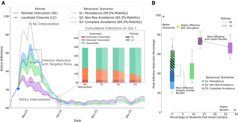
Figure 3.
Results of policy interventions with our calibrated ABM on contact networks from Fall 2019, derived from WiMob (A) This graph compares the mean active infections between LC and RI. LC show improved outcomes (shaded regions) even when constrained to the same restrictions of RI policies. (a)–inset: After the first wave, even though LC shows slightly higher active infections, the cumulative infections are still lower, especially those that are a result of internal transmission on campus. Figures S10–S17 show changes in cumulative infections under different policies, including th and th percentile intervals. (B) Outcomes of policies within the same behavioral scenario are shown with boxes of the same color (RI policies are solid, LC policies are hatched) and box heights represent the th and th percentile. In S1, even though LC and RI are equally burdensome in terms of students avoiding campus, LC shows improved outcome on peak reductions. In fact, for the other scenarios, LC shows better outcomes than RI, without forcing as many students into online schedules, and, therefore, being even less burdensome with greater impact. Figure S6–S9 show comparison of all policy outcomes with different budgets.

