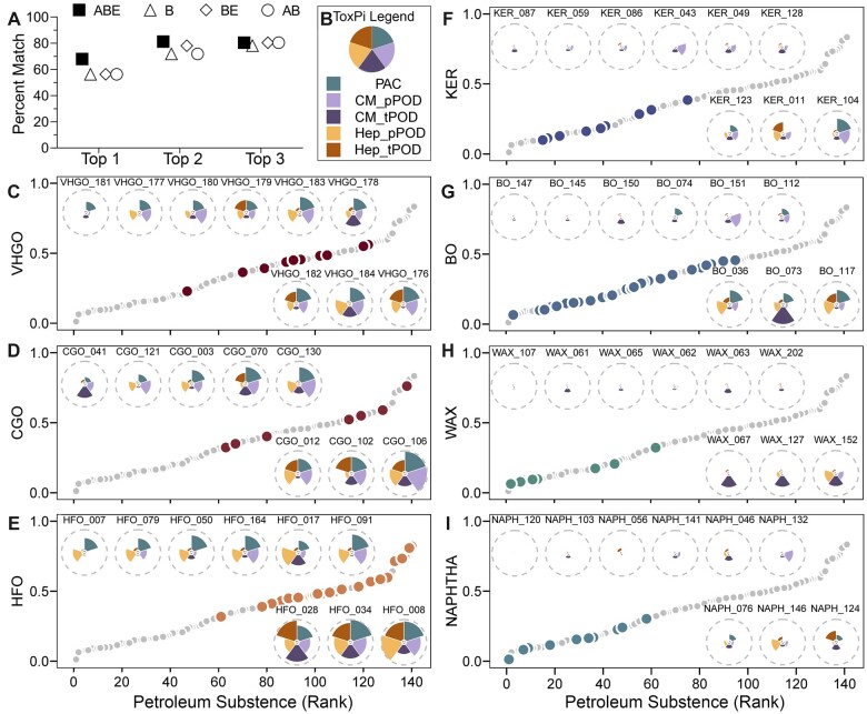
Figure 6.
Data integration and visualization using ToxPi to support selection of worst-case substance(s) in each category using PAC (3–7 ring) content and transcriptomic and phenotypic POD values from iPSC-Hep and iPSC-CM. A, A dot plot showing the percent match in ranking (top 1, 2, or 3 place) of the substances within their category using ToxPi scores using the data from all 6 cell types versus that from iPSC-Hep and iPSC-CM only. Hollow circles (AB): the pattern of PAC (3–7 rings) analytic data and transcriptomic PODs. Hollow diamonds (BE): the phenotypic and transcriptomic PODs. Hollow triangles (B): phenotypic PODs. Solid squares (ABE): all data mentioned above. B, ToxPi legend representing each included data type as a colored slice with equal weights. CM_pPOD: phenotypic POD data from iPSC-CM. CM_tPOD: transcriptomic POD data from iPSC-CM. Hep_pPOD: phenotypic POD data from iPSC-Hep. Hep_tPOD: transcriptomic POD data from iPSC-Hep. C–I, Scatter plots showing a rank order of all 141 petroleum UVCBs (gray dots) using their overall ToxPi score. Each panel represents the relative rank of the substances within each category (colored dots, see category labels on the y-axis and Table 1 for full description) for the categories with 8 or more substances. Insets show the actual ToxPi plots for selected individual substances in each category that are in the top ranked 3 (below the dot plot), middle 3, and bottom 3 (above the plot) substances.

