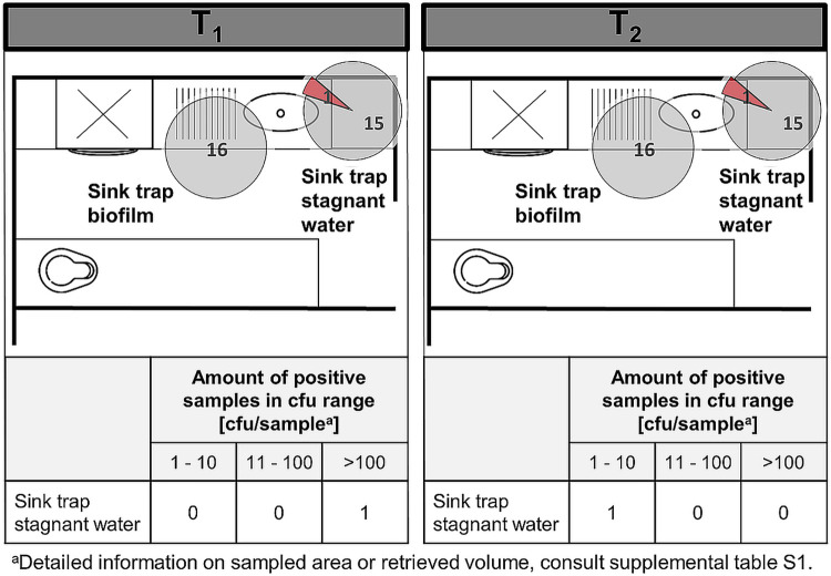
FIG 2.
Traps in soiled workrooms. Pie charts represent the amount of positive C. difficile findings (red) compared to negative findings (gray). The sum of red and gray portions per pie chart represents the number of total sampled sites in different rooms (and on different wards), during CDAD inpatient treatment (T1) in the respective ward (left) and after patient discharge (T2) (right). The floor plans are for illustrative purposes only and do not necessarily correspond to the actual room layout.

