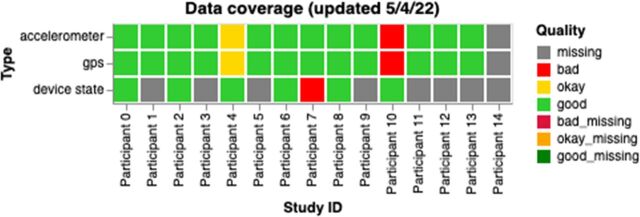
Figure 7.
A sample graph for researchers and clinical staff showing data coverage for all participants for a study. Each box is coloured based on the participant’s status: red for bad (data coverage <50%), yellow for okay (data coverage between 50% and 80%) and green for good (data coverage >80%). For device state, data quality was considered good if there was at least one data point per day, bad otherwise. GPS, Global Positioning System.

