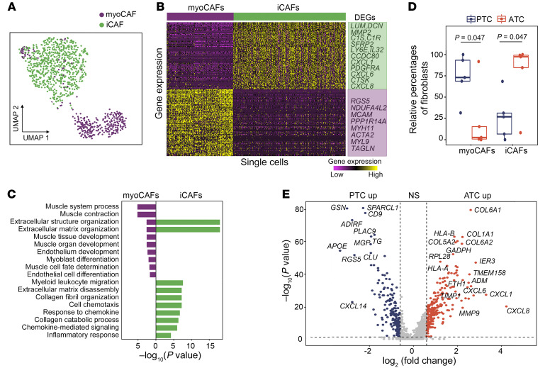
Figure 9. Plasticity of CAFs during ATC progression.
(A) UMAP projection of CAFs, colored by CAF subpopulations. (B) Heatmap of DEGs between myoCAFs and iCAFs. (C) Two-sided bar graph showing enriched GO terms in myoCAFs and iCAFs. (D) Box plot of relative frequencies of myoCAFs and iCAFs. P values were determined by 2-sided Student’s t test. The boxes are centered at the median and bounded by Q1 and Q3 quartiles. Upper whiskers indicate the minimum of maximum data and Q3 + 1.5 IQR, and lower whiskers indicate the maximum of minimum data and Q1 – 1.5 IQR. (E) Volcano plot of differential gene expression analysis between PTC- and ATC-derived CAFs. P values were determined by Wilcoxon test. NS: P > 0.05 or log2(fold change) <0.6.

