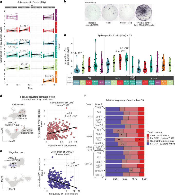
Fig. 5. Spike-specific T cell responses to antigen re-encounter after delivery of various vaccine regimens.
a,b, Normalized IFNγ production after stimulation of PBMCs with SARS-CoV-2 spike peptide pool measured by ELISpot assay. Longitudinal IFNγ response at T1 and T3. Black lines show the median (n = 581) (a). Representative images of one IFNγ ELISpot assay (b). c, Normalized IFNγ responses at T3 after stimulation with SARS-CoV-2 spike peptide pool (n = 255). Large black dots show the median of each group, and the vertical line spans the IQR. The horizontal line indicates the positivity threshold. P values indicate differences between the respective group and the overall mean of all participants. P values were calculated using the Mann–Whitney–Wilcoxon test and the Benjamini–Hochberg method to control for multiple hypothesis testing; only statistically significant P values (P < 0.05) are shown (a and c). d,e, UMAP of the T cell compartment (CD3+) showing the clusters with frequencies (d) positively and (e) negatively correlated with SARS-CoV-2 spike peptide-induced IFNγ response. Scatter plots show the frequencies of the clusters with the (d) highest and (e) lowest Spearman’s rank correlation coefficients (rs) when compared to IFNγ production (n = 255). f, Relative frequency per vaccine combination of the T cell subclusters with the highest positive or negative correlations to the SARS-CoV-2 spike peptide-induced IFNγ levels (n = 347). P values indicate differences between the specific group and the overall mean frequency of all participants of each T cell cluster per vaccine combination and were calculated using the Mann–Whitney–Wilcoxon test and the Benjamini–Hochberg method to control for multiple hypothesis testing; *P < 0.05, **P < 0.01 and ***P < 0.001. Only statistically significant P values (P < 0.05) are shown.

