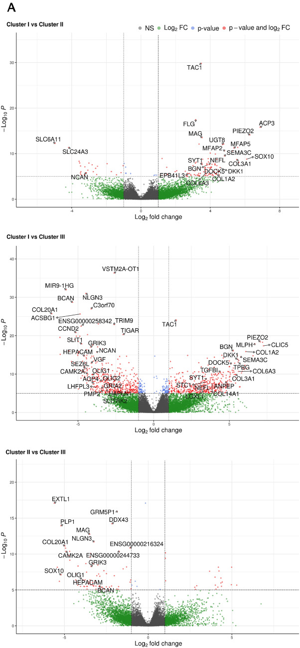
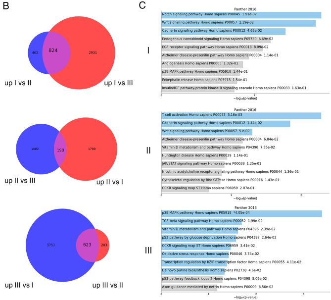
Fig. 5.
A, Volcano plots showing the results of differential expression analyses by comparing the three groups of previously identified samples in pairs. The cut-off for log2FC and for adjusted P value are > 2 and 10e-6. Only the names of the genes present in the previous heatmap or those more up/down-regulated in single pairwise comparisons are reported. B, Pathways differentiating the three GSC different clusters identified by gene expression enrichment:Venn diagrams showing the number of specific and common genes in the comparison between each cluster against the other two; the latter were considered as putative “marker genes” for each cluster and gene set enrichment was tested against the Panther (2016) metabolic and cell signaling pathway database. C, The bar chart visualizes the top 10 enriched terms and their p-values. Bars are colored based on their p-values, while an asterisk next to a p-value indicates the term also has a significant adjusted p-value (< 0.05). The three different clusters were indicated (I, II and III)


