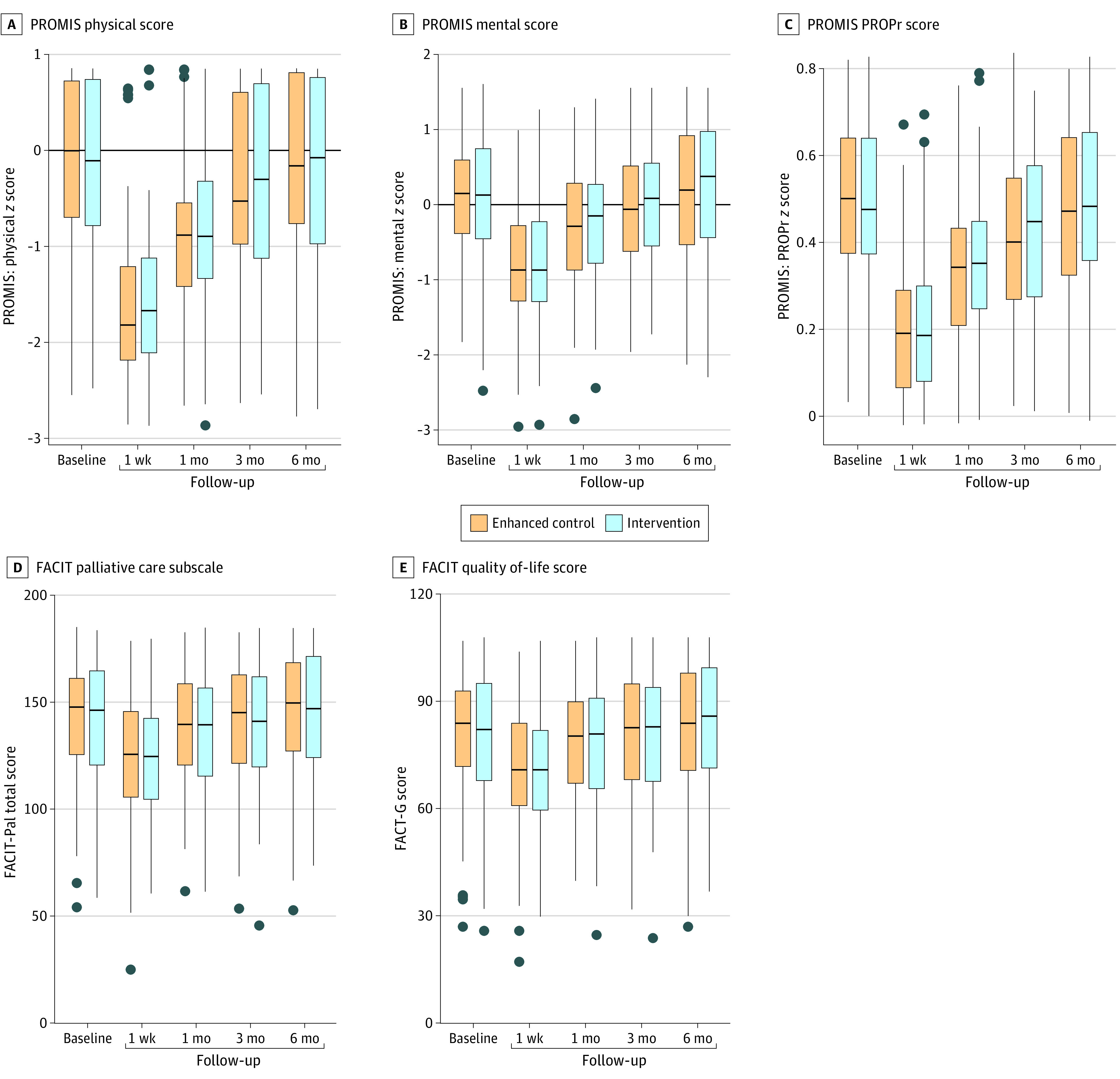
Figure 2. Comparisons of Patient-Reported Outcomes Across Time and Treatment Group.

Boxes indicate the IQR, black lines within the boxes indicate the medians, lines indicate quartile 1 − 1.5 × IQR (lower) and quartile 3 + 1.5 × IQR (upper). Dots represent potential outliers. FACIT indicates Functional Assessment of Chronic Illness Therapy; FACIT-Pal, FACIT–Palliative Care; FACT-G, Functional Assessment of Cancer Therapy–General; PROMIS, Patient-Reported Outcomes Measurement Information System; PROPr, PROMIS-Preference.
