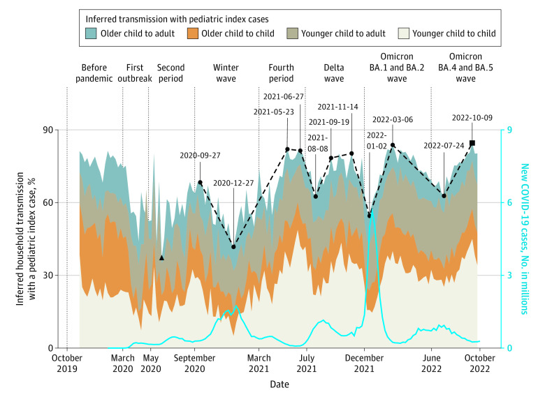
Figure 3. Patterns of Inferred Household Transmissions With a Pediatric Index Case.
Lowest and highest percentages during the pandemic are highlighted with black triangle and square points, respectively. Vertical lines define the beginning of each pandemic period. The blue line is the number of new US COVID-19 cases. The points with dates are relatively high and low levels of pediatric transmissions and the dashed line is the trend with these points.

