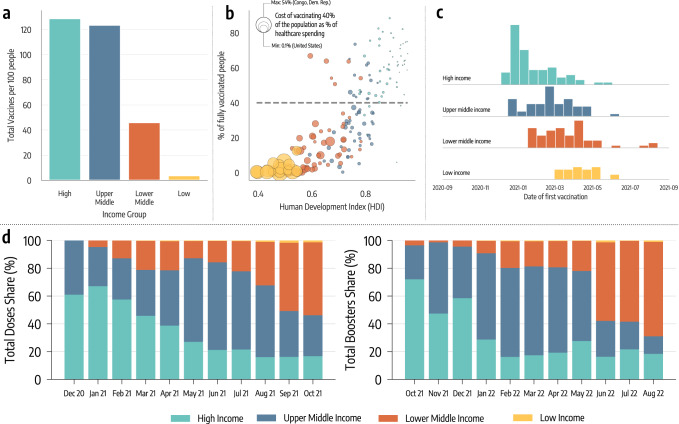
Fig. 1. Vaccine inequities.
a Total number of doses administered per 100 people in different income groups as of October 1, 2021. b Scatter plot of % of a country’s population who is fully vaccinated versus their Human Development Index (HDI). The color of dots indicates the country’s income group while size is proportional to the cost of vaccinating 40% of the population as a percentage of current healthcare spending. c Histograms of the date of first COVID-19 vaccination across different country income groups. d Evolution in the share of doses administered monthly across country income groups (left hand), and evolution of monthly booster doses share (right hand side).

