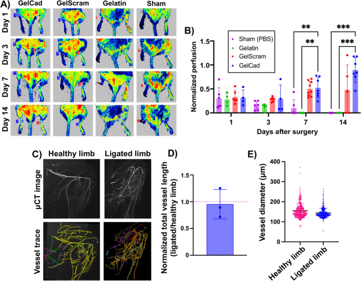
Figure 5: Recovery of perfusion after femoral artery ligation and hydrogel delivery.
A) Representative LDPI images at each assayed time point as a function of treatment. For each mouse, healthy limbs are on the right side and ligated limbs are on the left side.
B) Quantification of normalized perfusion (ratio of LDPI signal in ligated limb relative to healthy limb in the same mouse) as a function of treatment at each assayed time point. Each data point represents an individual mouse and data are presented as mean ± SD from N=5–9 biological replicates per condition. A two-way ANOVA mixed effects model with the Geisser-Greenhouse correction and Dunnett’s multiple comparison test was used to assess statistical significance (**, p<0.01; ***, p<0.001).
C) Representative μCT images and corresponding vessel traces of healthy versus ligated limb in a mouse treated with a GelCad hydrogel. In the vessel trace images, colors indicate annotation of individual vessel networks. Colors are automatically and randomly assigned by the software to visually separate the vascular networks when tracing. The workflow for this imaging analysis pipeline is shown in Supplemental Figure 3.
D) Quantification of total vessel length in the hindlimbs. To account for variance in perfusion with the MICROFIL polymer, data are presented as normalized vessel lengths for ligated versus healthy hindlimb in the same mouse. Each data point represents an individual mouse and data are presented as mean ± SD from N=3 biological replicates. The red line indicates the expected ratio for two healthy limbs.
E) Aggregated vessel diameters from the vessel trace data for healthy and ligated limbs. Each datapoint represents a single vessel (determined from branch point analyses). Data are presented as mean ± SD from N=3 biological replicates. Statistical significance was calculated by a student’s paired t-test (no significant difference).

